
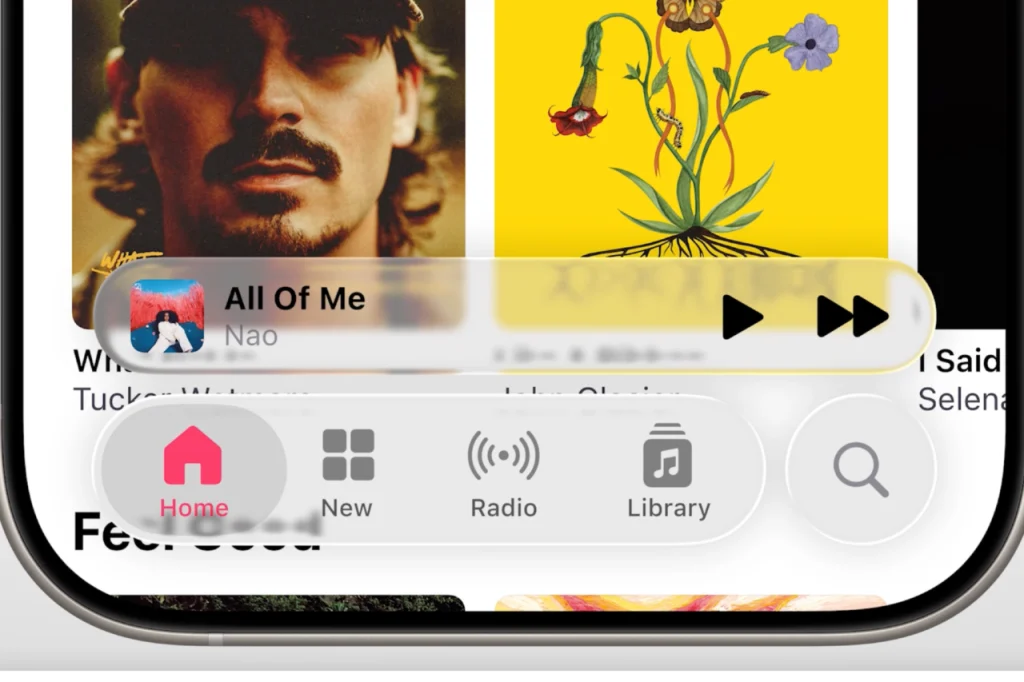
Apple’s major software revamp has officially arrived—and it’s about to change the way your devices look and feel. Unveiled at WWDC 2025, the new design language, dubbed “Liquid Glass,” marks a bold shift in Apple’s visual identity. Think softer edges, more transparency, and a generally more fluid, “bubbly” interface across the board. This sweeping redesign touches nearly every Apple product: iPhones, MacBooks, Apple Watches, and even the Apple TV 4K.
While the aesthetic overhaul reaches across the entire Apple ecosystem, it’s iOS that stands out as the most dramatically transformed—and likely the most talked about. That’s no surprise: with tens of millions of iPhone users in the U.S. alone, even minor UI changes can ripple widely. And from what we’ve seen so far, iOS appears to be the most deeply reshaped by this new visual direction. Just take a look:
Apple hasn’t outright said it, but the influence behind its new design language—Liquid Glass—is clear: it draws heavily from what designers often refer to as glassmorphism. This style emphasizes frosted, semi-transparent layers and depth, moving away from the flatter, more subdued “neumorphic” look we’ve seen in recent years. Think of it as UI with added texture—shapes feel more dimensional, and menus float with a bit more visual flair. If you’re looking for a frame of reference, Microsoft’s design system has already been playing with this concept for a while.
Now, I’m no design expert, and someone with a keener eye could probably write a dissertation on Apple’s shift here. But from my perspective, what stands out more than anything else is the risk. That risk is, in many ways, refreshing. Apple’s last major UI overhaul was with iOS 7—back when iPhones still had home buttons and healthcare debates dominated the news. In recent years, the company has faced criticism for playing it safe, especially compared to its Jobs-Ive era of bold experimentation. A visual shake-up like Liquid Glass is a strong signal that Apple is once again willing to take creative chances, particularly with something as fundamental as the iPhone interface.
That said, risk always comes with tradeoffs—and one of the biggest here may be accessibility. While the design is undeniably sleek, some early impressions suggest that the new translucent elements can hinder readability. In theory, layering clear panes over content looks modern. In practice, when text and visual noise overlap, menus can become muddled and harder to navigate. It’s not just a design choice—it’s a usability concern. The contrast seems reduced compared to earlier iOS versions, and slight differences in menu placement can significantly affect clarity.
From what we’ve seen so far, some variations of Liquid Glass appear more legible than others, suggesting Apple may offer different styles or levels of transparency to accommodate different needs. Still, nothing is final yet—this redesign isn’t officially launching until the fall, which means Apple has time to refine and respond to feedback.
Ultimately, whether you love or loathe the new look will depend on your priorities: aesthetics, usability, or both. But one thing is undeniable—this is Apple’s boldest UI gamble in years. Messing with the core experience of hundreds of millions of iPhone users isn’t a small move. Let’s just hope that, in pushing boundaries, Apple hasn’t made things too blurry for the people who rely on clarity the most.
