
Google is once again tinkering with the user interface of its native Contacts app. Following a prior glimpse into a more streamlined single-contact page, a recent discovery reveals a tweak to the top search bar.
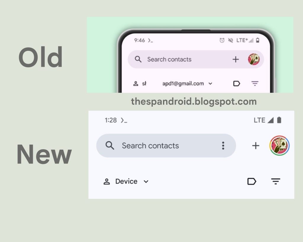
In a move reminiscent of spring cleaning and decluttering, Google is quietly revamping the top search bar of the Contacts app. This update pushes the account switcher and “add contact” button to the side, offering a more compact layout. While seemingly minor, the adjustment brings a Play Store-esque vibe to the app’s aesthetics.
Currently hidden behind obscure flags, accessible only to rooted Android users, this change hasn’t reached the wider audience. The revelation comes courtesy of AssembleDebug on TheSpAndroid, who has been uncovering various UI tweaks in recent weeks.
As with many experimental endeavors, this redesign may be fleeting, subject to Google’s penchant for exploring multiple design avenues simultaneously. However, it prompts speculation about the broader direction of the Contacts app. Despite its status as a background utility, could this redesign hint at forthcoming features? With Google I/O on the horizon, where new Android features are traditionally unveiled, the timing is ripe for conjecture. In a few short weeks, we may uncover what Google has in store for Contacts.